
Two lines account for nearly all the variation between American metros: housing and state income tax. Everything else — groceries, utilities, fuel, services — varies far less than people assume.
So the comparison that works is short:
(gross − tax) − annual housing = the number to compare
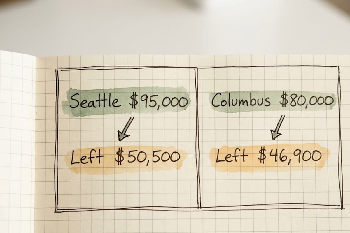
Worked example
An offer of $95,000 in Seattle against $80,000 in Columbus, Ohio:
| Seattle | Columbus | |
|---|---|---|
| Gross | $95,000 | $80,000 |
| Federal + FICA | −$19,300 | −$15,100 |
| State income tax | $0 | −$2,400 |
| After tax | $75,700 | $62,500 |
| 1-bed rent × 12 | −$25,200 | −$15,600 |
| Left | $50,500 | $46,900 |
Seattle wins by $3,600 a year — not the $15,000 the headline suggests. Move the rent gap by $300 a month and the ranking reverses.
That is the whole point of doing the arithmetic. A 19% higher salary produced a 7.7% higher remainder, and the difference disappeared into two lines.
Why cost-of-living indexes mislead

A published index averages six to eight weighted categories: housing, groceries, utilities, transport, healthcare, goods and services.
Across US metros, most of those categories fall within about 10 to 20% of the national average. Housing routinely varies by 200 to 300%. Averaging a category that swings threefold with five that barely move produces a single number that understates the only difference that matters.
An index saying "City A is 35% more expensive" typically means housing is 120% more expensive and everything else is roughly the same. Those two statements lead to different decisions.
The parts an index gets wrong for you specifically
Housing weight assumes a household. Indexes weight housing at something like 30% of a typical budget. For a single renter in an expensive metro it is closer to 45%, so the index understates the impact.
Owning and renting diverge completely. An owner with a fixed mortgage from years ago and a new renter in the same city face entirely different costs, and no index separates them.
Transport depends on your commute, not the city. A car-free household in a transit city saves $6,000 to $10,000 a year in ownership costs that never appear as a city-level number.
Childcare is enormous and usually excluded. $800 to $2,000 a month per child, varying widely by metro. For households with young children it can exceed the housing difference.
The two adjustments worth making by hand
Sharing. A two-bedroom split two ways typically needs 40% less income per person than a one-bedroom alone. This is a bigger effect than any plausible salary difference or any state tax, and it is the lever most people leave unused when comparing cities.
Commute time, priced. An hour a day each way is ten hours a week. At $35 an hour that is $18,000 a year of time, and it is the hidden cost of the standard "cheaper housing further out" compromise.
Where trade wages complicate it
For the trades tracked here, the high-wage states are frequently not the expensive ones. Oregon and Washington pay electricians and plumbers more than California does with substantially lower housing costs, and Illinois sits near the top of several tables while being inexpensive outside Chicago.
That combination — high wage, moderate cost — is what this arithmetic is for finding, and it is invisible if you assume pay tracks cost of living. The state wage tables and why union density drives them are the other half of the calculation.